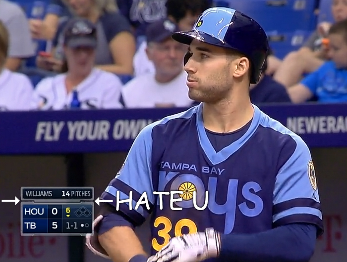
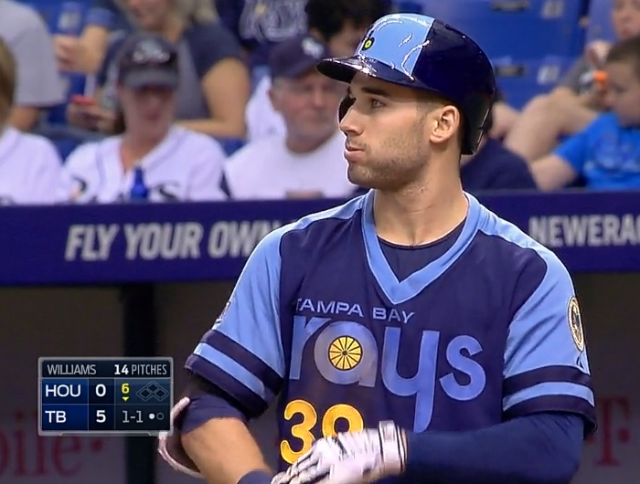
Fox changed its graphics for MLB telecasts this season and now I can't watch Fox MLB telecasts because all I see is the score bug's tabbed gap, which irritates me to no end.

I just want to reach into the screen and squeeze the two boxes together.

EH?
I'm not fond of the typeface for the pitcher's surname either. It looks particularly hideous when a pitcher has a long surname.
ESPN changed its graphics for SportsCenter this week.

I find Bristol's new hotness both too basic and not minimalist enough.
My all-time favourite use of Helvetica on television is the graphics for MTV's Sports and Music Festival 2.

We made up an imaginary scientific facility where odd hybrids and mutant machines were being created, and designed around that concept. The stark white empty graphics tried to go in the opposite direction of how "extreme" sports are usually packaged. [source]
With music by the Dust Brothers!
